Visitor System
An all-in-one system that delivers a fresh experience for both visitors and employees — shifting from paper-based chaos to a unified digital platform serving 4,800+ annual visitors across 4 locations.
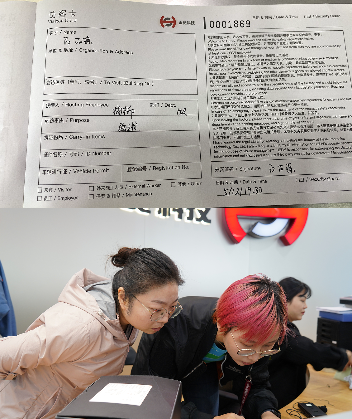
Hesai was at a stage of rapid growth. Their visitor process still ran on paper.
100+ visitors per day at 4 locations. But the check-in process was entirely paper-based — creating security risks, communication gaps, and a poor first impression at a company preparing for its NYSE IPO.
Invitation process required initiating multiple approvals through the OA system — area access, meals, and gifts each required separate flows with no unified tracking
Paper-based front desk registration posed information security risks and created no audit trail as Hesai prepared for its NYSE listing
Complex information synchronization between staff and front desk — communicated verbally or via chat, leading to constant last-minute scrambles
Zero formal welcome experience for visitors — no brand touchpoint, no feedback channel, no before or after-care
Clarify with users
I interviewed different parties to understand the full visitor journey from every angle — employees, admin staff, and visitors alike.
Define the problems
The invitation process required initiating multiple separate approvals across the OA system. Staff had to track each one manually.
As the company prepared for its IPO, these security risks became completely unacceptable with zero audit trail.
No formal welcome, no feedback channel. The first impression didn't match the company's ambition or IPO-readiness.
Turn three pain points into design opportunities
Build an integrated system for all visit-related approvals?
Red zone + Gift + Dining → One unified invitation form
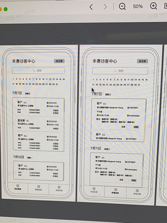
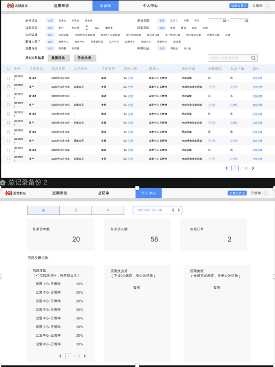
Store information and track visitor status in one place?
Paper forms → Digital dashboard with full audit trail
Deliver information and gather feedback before and after visits?
Nothing → Visitor mini-app with company content & feedback
Let engineers join the table
We explored three different approaches before landing on the right one. Each rejection taught us something about what users actually needed.
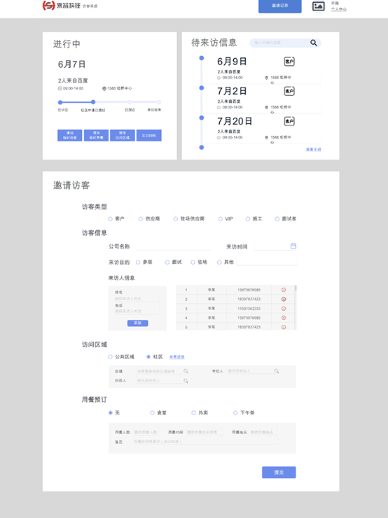
There are already too many forms in the OA system. Instead of adding another long one, I split the invitation flow into three focused panels: today's visits, a step-by-step invitation form, and future visit tracking. Each step reveals only what's needed — reducing errors and making the experience feel light instead of burdensome.
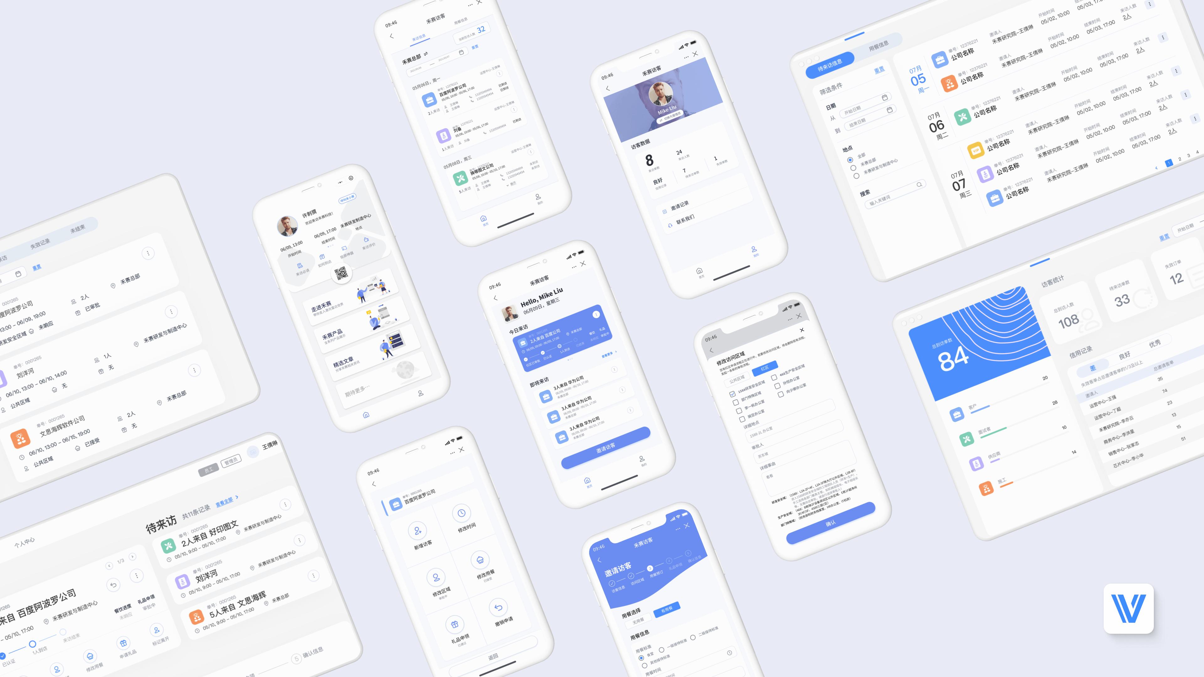
One system, four touchpoints
Rather than building a single app, I designed a platform that meets each user where they already are — mapping each role to their natural tool and context.
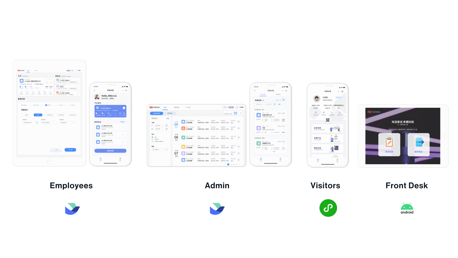
Three users, three journeys
All approvals (red zone, dining, gifts) now run in parallel through one form instead of three separate OA flows.
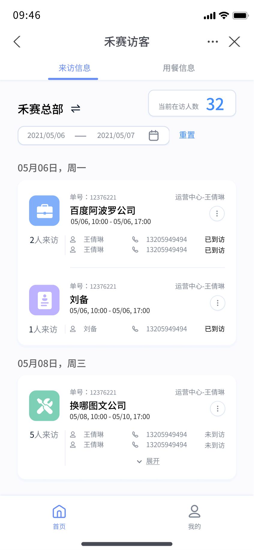
Admin staff get a unified dashboard to review upcoming visits, approve access, and view real-time statistics across all 4 locations.
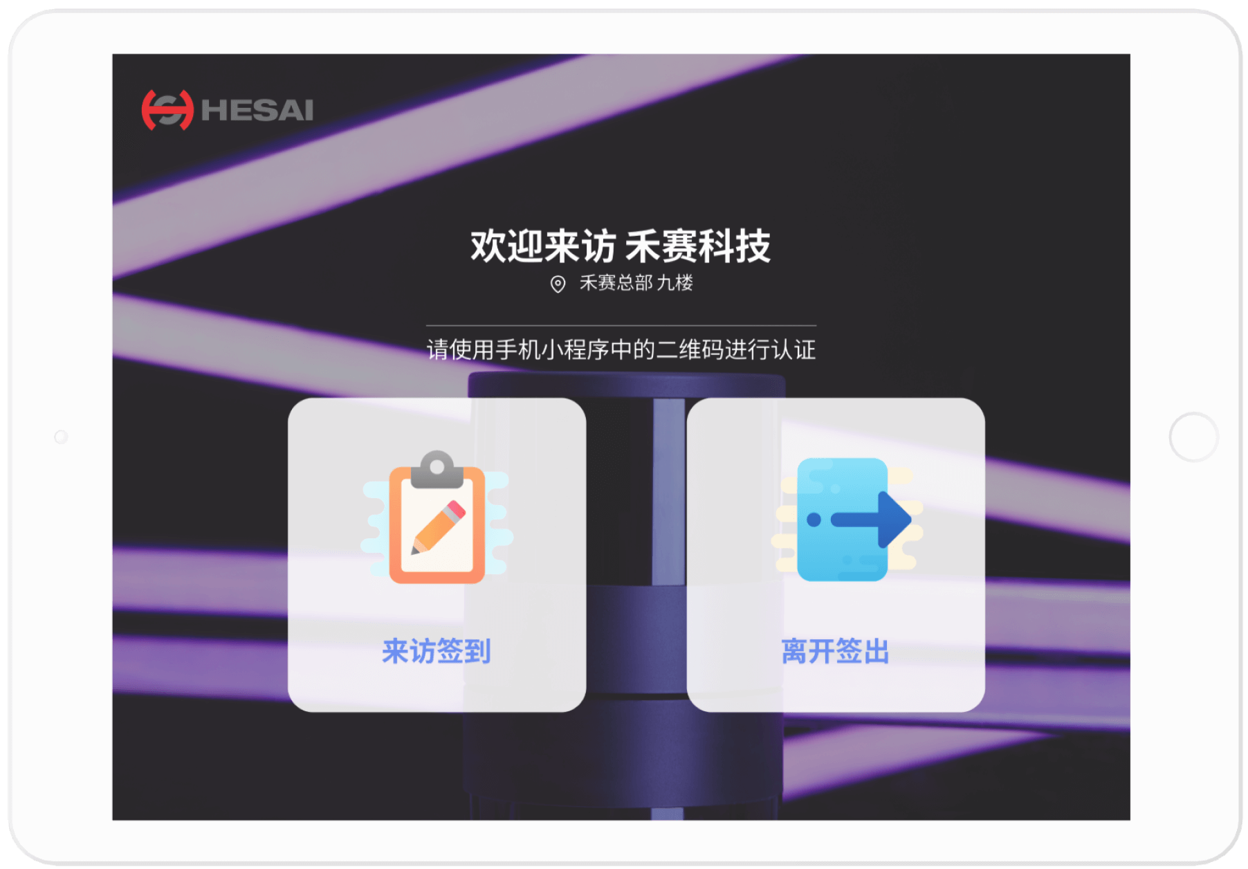
Visitors arrive prepared — they've seen the company profile, know where to go, and check in with a single QR scan. No paperwork, no waiting.
Training, testing, iterating
Created user manuals and video tutorials. Held 2 workshops for Sales and HR departments to ensure confident adoption from day one.
20+ functional modifications across 6 releases. Standardized approval flows and added privacy policy in collaboration with the Legal team.
Launched desktop first, collected real usage feedback, then designed and shipped the mobile Feishu version in September 2022.
By the numbers
The system launched in October 2021 and went through 6 iterative releases, including a mobile expansion in September 2022. It completely replaced the paper-based process.
"The system reduced manual check-in errors to near zero and gave us a verifiable audit trail — critical as we prepared for our NYSE listing."
What I learned from my first 0→1 product
Each role had fundamentally different needs. The same system needed to feel simple for visitors and powerful for admins. One product, four distinct experiences designed from the ground up.
A single visitor invitation could trigger up to five parallel approval chains. I worked closely with engineering to map every possible state, running 60+ test scenarios before launch to surface edge cases.
We launched desktop first, learned from real usage, then adapted for mobile. The second release was significantly smoother because we had real-world signal instead of assumptions.
Enterprise design means navigating organizational dynamics. Getting buy-in from security, IT, and operations was as critical as the interface design itself. Facilitation is a core design skill.
"The experience fundamentally changed how I approach collaboration, communication, and the long game of shipping software."