Scaling a FMCG brand from scrappy startup to 600% growth through design
Three versions, three business phases, one design evolution
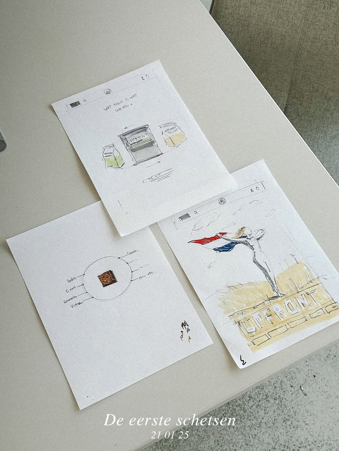
Each redesign wasn't cosmetic — it was driven by a shift in business strategy. I grew with the company from the only non-Dutch hire to leading a 5-person design team.
Cluttered, inconsistent, no system
The original site had heavy UI elements, inconsistent styling, unclear hierarchy, and no reusable components. Product categories were hard to navigate.
Simplify, systematize, establish credibility
I stripped back the clutter, restructured product categories, built the first reusable component library, and established direct communication with the remote dev team. This earned me the role of Website Manager — the first non-Dutch hire.

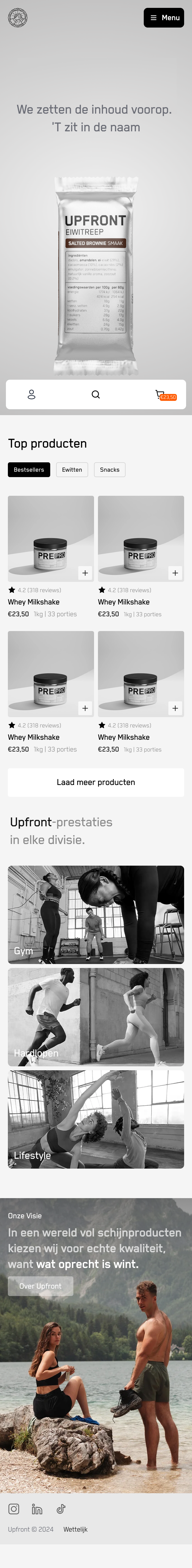
Product-centric, concept-driven, mobile-first
Heatmap data revealed mobile-dominant usage and high interest in ingredients. I introduced the core concept: putting the back label upfront — flipping the product to show what's inside. Mobile UX was redesigned as an app-like experience with thumb-zone CTAs.
This version was featured on SeeSaw and gained 10M+ impressions from design influencer attention on social media.
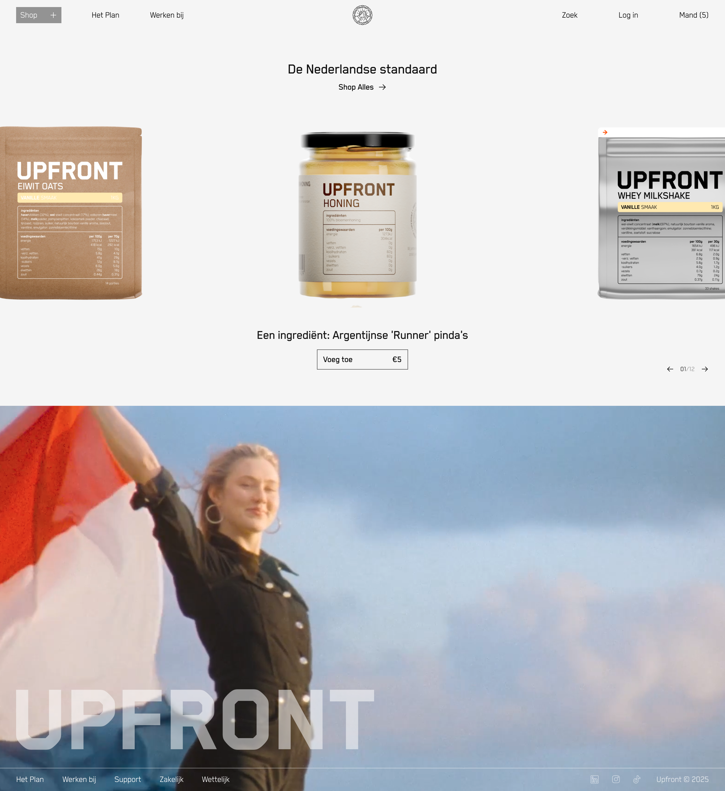
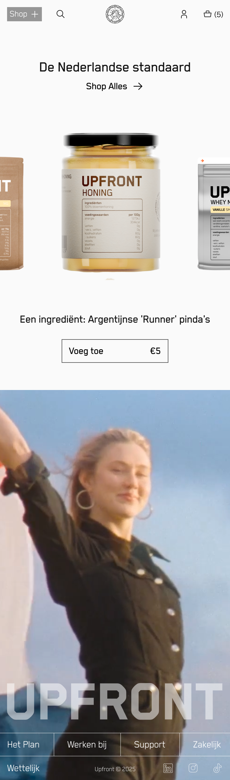
Product speaks for itself
With 600% online growth, the brand no longer needed to explain its concept — it needed to get out of the way. Radical minimalism: every element earned its place. Ingredients moved to center stage.
Design follows business phase, not trends
Each version solved a different strategic problem. V1: clarity. V2: brand awareness. V3: conversion efficiency.
Heatmaps changed everything
Introducing heatmap analytics revealed that mobile users cared most about ingredients — reshaping the entire V2 direction.
From individual contributor to design leader
I grew from design assistant to leading a 5-person team, managing design system, web, email, and ads across all channels.
Minimalism is earned, not imposed
V3's radical simplicity only works because V2 built the brand recognition. You can't skip the storytelling phase.